This is an article I wrote to help new designers understand the importance of designing and styling each and every word of a website, that even the best designed website can fall flat if thought and care is not given to the content. After all our websites are only a vehicle for the copy - the message we want to get across....
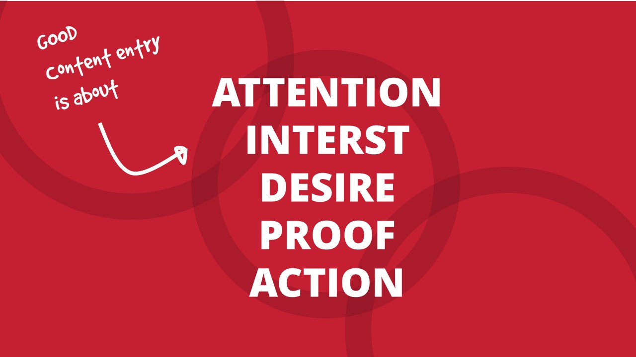
AIDA has been around in advertising since before little web was born. Attention, Interest, Desire, Action. And it has lost none of its relevance now, in fact it has been given new life with the hard job of attracting people’s attention in the noisy, busy World Wide Web.
So what I am saying is nothing new, but how often do you see a website that has an engaging homepage, interesting subject matter, then you click on a link and the whole thing falls flat, it’s a wash with small grey text. You glaze over, click once more then move on to somewhere able to engage you better.
Why is this?
Because we don’t pay as much attention to entering content as we do to the rest of the website. AND IT’S SO IMPORTANT. Excuse the capitals, but it is.
Before I engage with the words, however well sculpted they are, I need to be drawn to them. I’m not even going to know how great they are unless you interest me with something as simple as the size, colour, style and layout of the text itself. I am so used to banners and headers and footers and big photos that often I just blank them out. So what are we left with? A long page of small grey uniform text and if we are lucky, a couple of headings.
What do we do about it?
We care. We care right until the moment the website is launched and then we care more, content is not a slap-dash, oh my goodness we need to launch HELLLLLP whack it in. It needs time and thought with each new page or article added. like the care put in by the planners, designers and developers who built the site.
Here are some exercises you can practice anywhere anytime that will make you care!
Read the Paper
Each day you get a moment to read your paper, or relax with a magazine.. I know I know its not that often. But study it with new eyes.
How do the articles grab your attention. What is the style of that publication. Why is it that style. Do they do it well. Did they draw you in, if you scan read it was there something that grabbed you to read more?
It only takes a minute or two so try getting into the habit for a week.
Listen to how you speak
Say something and listen at the same time, actually the more you do this the more eloquently you will speak and it’s not all one monotone blurb that’s for sure. So start styling up content as if those words were your words and your life depended on getting that message across.
If you say the four lines below you will automatically emphasise each sentence differently, giving it varying impact and therefore creating emotional engagement. This is what we need to do with text online too.
Hey guys, we’re going to learn something fun.
We’re going to learn how to style content.
My god when you can do this you will have women falling at your feet.
Look, I have managed to snag myself a husband.
So what are you waiting for, go go go open your browser and start styling.
Look out for websites that do it well
Find 3 very well designed web pages and document how they do the following:
Grab me — give me a headline
Guide me — an interesting intro
Inform me — ok some text is good
Impress me — wow that was useful/interesting — a statistic or fact
Steer me — yes I need some well formatted titles, text and links
Humour me — well if you can
Don’t lose me — I’m falling asleep, give me some bite sized — bullets or highlight
Prove it — ok I get it — and I can see it without hunting
You got me — ok where do I sign.
Here are some examples…..
https://www.suttonhoochicken.co.uk/our-birds/
https://www.vikinggallery.co.uk/about-us/
Content heavy…..
http://www.postoffice.co.uk/passport-check-send
And taking it a step further…..
http://www.fatmedia.co.uk/
DOs
- Treat me as though I have the attention span of a short attention spanned gold fish.
- Its ok to break text up pull bits out, don’t feel you have to stick to the splurge you have been given.
- Break up paragraphs, I won’t read a long one so break it up and highlight bits I really need.
- Treat me as if I really don’t care. But your life depends on it.
- Do this on all pages including articles.
- Make like a magazine.
DON'Ts
- Don’t just fall into the trap of bolding some words in a sentence as that is difficult to read.
- Don’t confuse me. Only highlight what is important and do it in a hierarchal way.
- Don’t suddenly shout at me down the bottom of the page. If it is so important why isn’t it near the top.
- And absolutely really don’t hid what it is you want me to do next.
But how do you put this into practice yourself?
Follow Style Guides
Most web designers will provide lovely designs, that don’t just cover the developers work but also showcase how the content should be styled.
And you should be provided with a style guide as well showing you each style of text available to you and what to use it for.
Always refresh yourself with these when you start to add content. You should have all those styles in your WYSIWYG editor, and have been trained how to use them appropriately. This is what those styles say to me….
Think about your copy
So next time you are adding a new page, blog post, recent event, any content to your website. Talk it through in your head and style it with a burning desire to get that message across and guide your reader to the action or outcome you want them to take.
--
I am a freelance Website Designer, Logo Designer and Graphic Designer based in Woodbridge, Suffolk. Contact me for more information.


