We love our amazingly diverse and entrepreneurial food and drink producers in Suffolk and I'm always trying a new product that comes on to the shelves. We are also fortunate to have two supermarkets - Co-Op and Waitrose in the coastal area that make it their duty to promote and stock local brands.
Here are a few sites that i thought reflected the product well, or made me smile.
harrisonsbakery.com
Lets start with the sugary sweet. This site is having some fun and you just want to dig deeper into that fun.
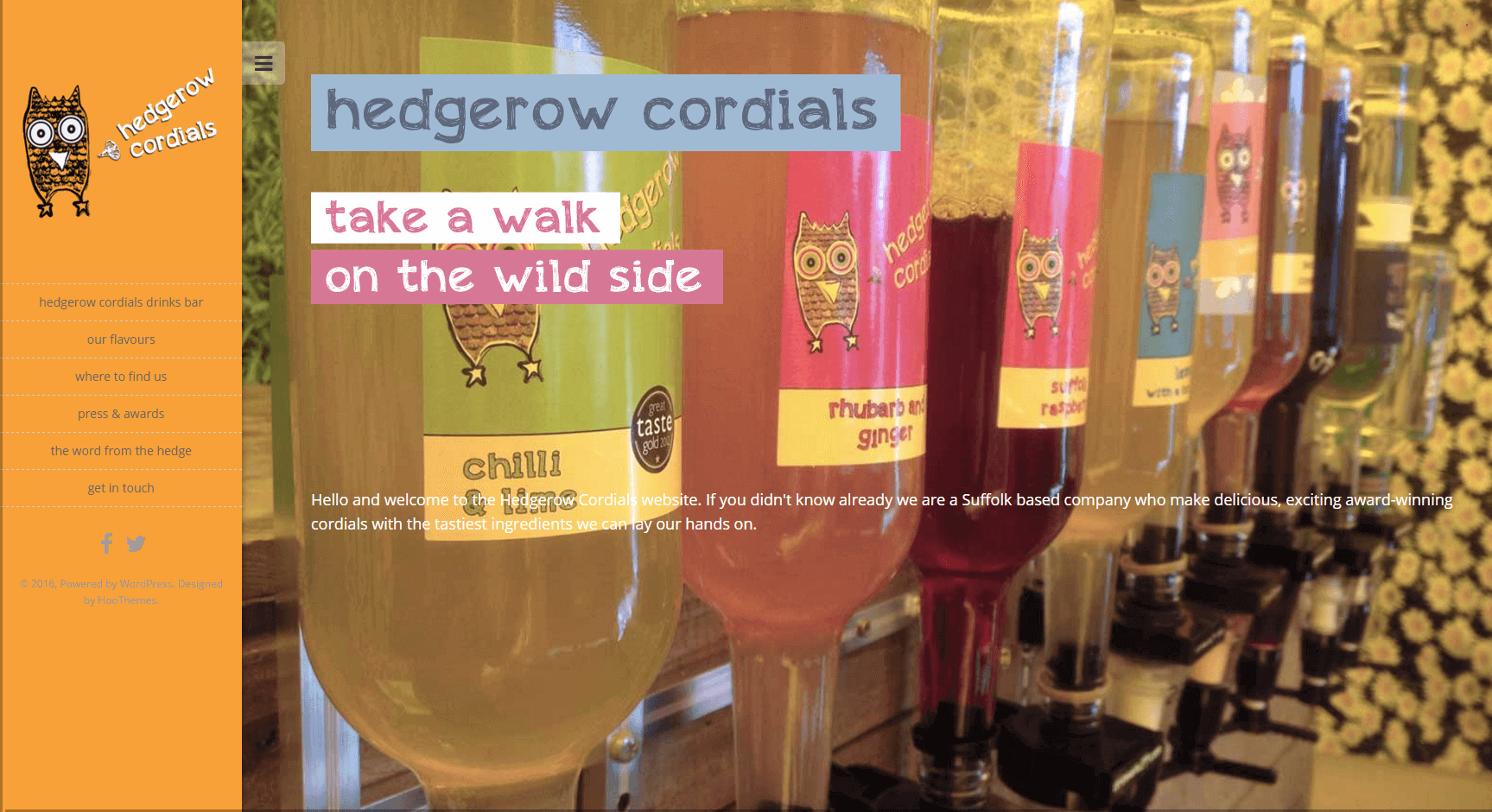
hedgerowcordials.co.uk
Owls are in. Left menu, simple and quirky, I definitely warm to the brand.
www.hillfarmoils.com
The right balance of craft and quality. I think this is really elegant, informative and naturally delicious, showing the oil as a cut above the rest.
scarlettandmustard.co.uk
It's not rocket science, it's salad dressings. I like the not taking ourselves too seriously whilst giving me a feel it will certainly and fun and spice to my mealtimes.
twomagpiesbakery.co.uk
Dark sites are sometimes difficult to get right this one does it well.
currypie.co.uk
Bringing together two British traditions, the curry and the pie. Class. And a good simple honest hardworking no frills site too.
fairfieldsfarmcrisps.co.uk
I can feel those potatoes straight out of the ground with nowt taken out and. Original, down to earth and interesting.
www.wildmeat.co.uk
The hare looks terrified, not surprisingly! but good use of a responsive grid layout.
herbalhaven.com
In a brave new world of grids and flat design I like the the rugged feel, a good reference back to the herb's ancient roots.
suffolksalami.co.uk
This shows how even a really simple site can look neat, elegant to promote the quality of a product.
stokessauces.co.uk
The character of the sauces comes through in spoonfuls on Stokes, as does the provenance of the brand.
salterandking.co.uk
Beautiful use of grays and illustration representing the tradition of butchery and acting as a good platform to promote the product shots.
englishwhisky.co.uk
I like the use of colour here, matching the traditional craft of Whiskey with a young buzzy feel.
colchesteroysterfishery.com
Good photography always boosts a website, the grey acting as a sophisticated base to promote the images.
MRSBENNETTS.CO.UK
i was surprised at first but love the shun of colourful chutneys in country kitchens for the dark spot lit conquistador... this chutney has some balls.
lucysdressings.co.uk
I get the feeling of Spring and Summer holidays - fresh and light with a bit of a sparkle
hodmedods.co.uk
A nice earthy feel and promotion of the raw product with a good use of HTML and CSS transitions effects.
petiteandsweet.co.uk
Simple elegant fine detail reflecting the product with good use of colour.
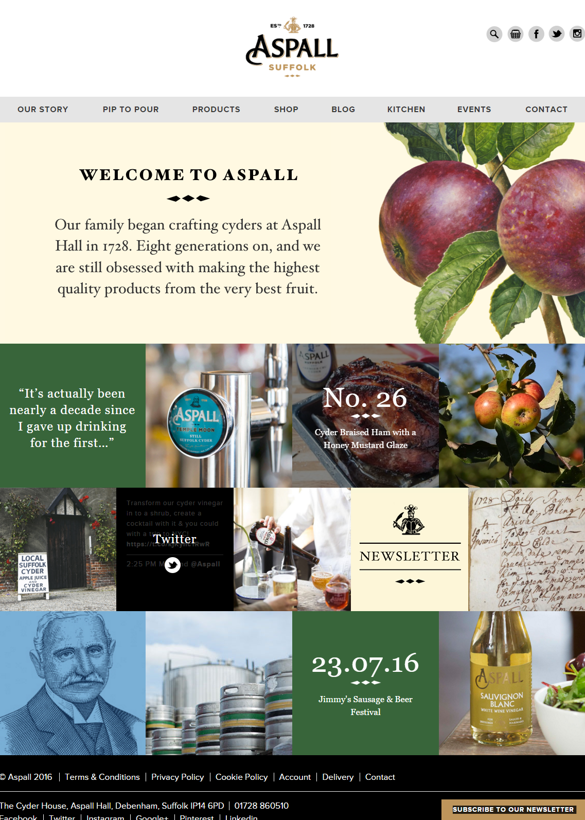
aspall.co.uk
A refreshingly original layout true to the Aspall brand.
It's always nice to happen upon great design as I look around the web, especially small local businesses doing a great job.
--
I am a freelance Website Designer, Logo Designer and Graphic Designer based in Suffolk.
Contact me for more information.


